Helping small teams turn analytics into action
2026
This concept explores how AI can help small teams move from analytics signals to concrete team actions. Instead of replacing analytics tools, the experience acts as a decision layer on top of an existing dashboard: it highlights important changes, explains likely causes with supporting evidence, and helps users turn insights into actionable tasks.
- Role
- Product designer
- Focus
- AI UX, Dashboard UX, SaaS, Analytics
- Deliverables
- Product framing, UX research, user flow, interaction design, UI design, prototyping
- Tools
- Figma, FigJam, Notion
Problem Statement
Small teams do not lack analytics data. They lack a clear path from data signals to actionable decisions.
Tools like GA4 give teams access to many metrics, but for founders, marketers, and product managers without a dedicated data analyst, answering a simple question like “Why did conversions drop this week?” can quickly become complex.
Users often need to compare multiple reports, understand segments, check tracking events, interpret metric changes, and decide what to do next.
The real problem is not access to data. It is the gap between reading analytics, understanding what matters, and turning that understanding into action.
What research revealed
To challenge the opportunity, I conducted lightweight social research across public discussions from small business owners, marketers, product managers, and SaaS/e-commerce teams.
A recurring pattern emerged: users were not necessarily missing data, they were missing guidance.
The main pain points were:
- analytics tools feel powerful but difficult to use day to day;
- small teams struggle to know which metrics deserve attention;
- users often doubt data reliability because of missing events, tracking issues, or attribution gaps;
- reports show what happened, but rarely explain why it happened;
- teams want clearer summaries, priority insights, and recommendations they can act on.
Product hypothesis
If small teams can connect their analytics data, ask questions in natural language, understand the likely causes behind a change, and turn the answer into a concrete task, then they can make product and marketing decisions faster and with more confidence.
This hypothesis shaped the core flow: the AI experience should not stop at answering a question. It should help the user move from analysis to execution.
Solution
Turn hard-to-read analytics into concrete next steps.
The experience lets users connect an analytics source, view a simplified performance dashboard, ask AI questions about their data, and turn the answer into an action inside the tool their team already uses.
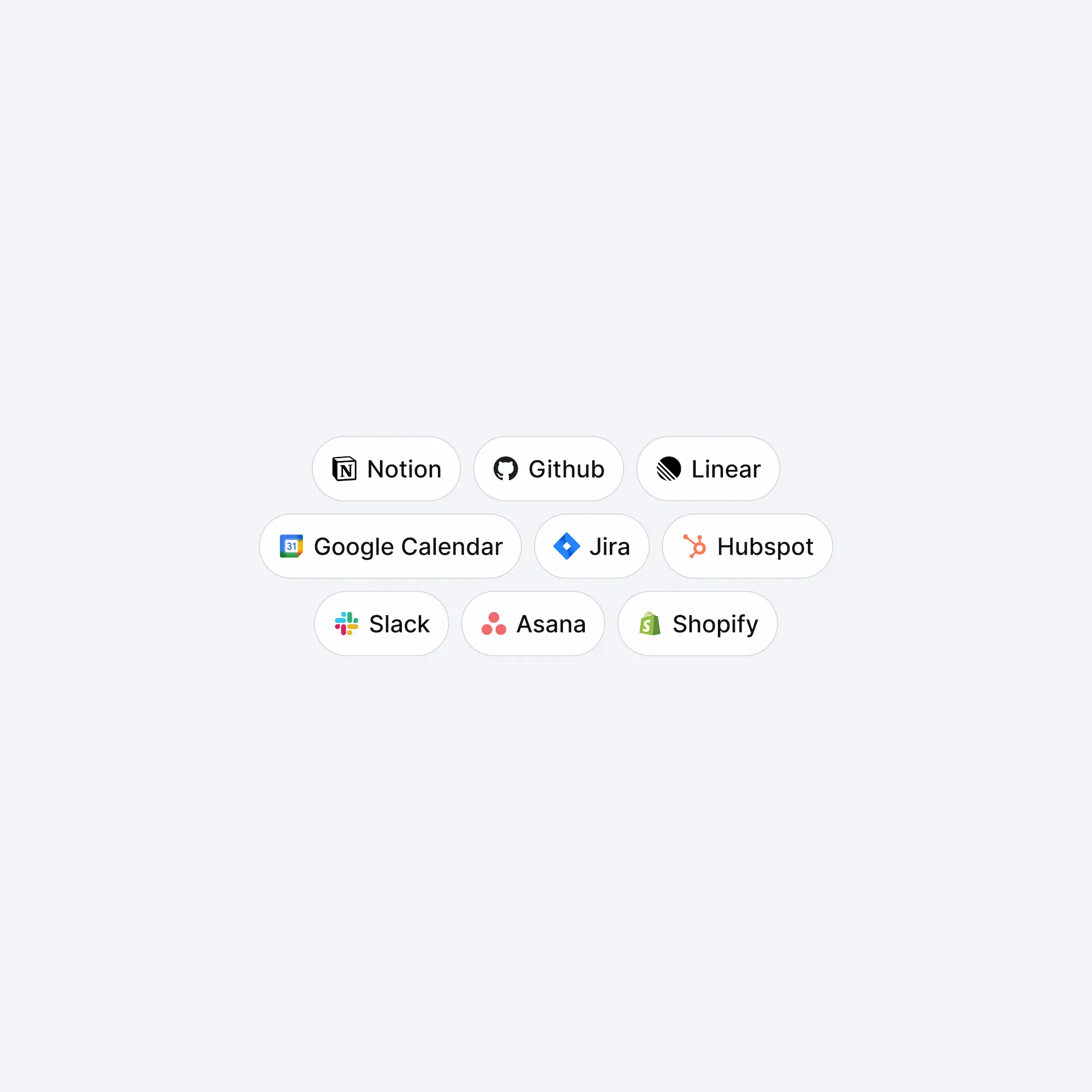
For the demo, I used Notion as the task destination. In a real product, the destination could adapt to the user’s workflow and stack: Notion for task lists, Linear or Jira for product tickets, Slack for team summaries, or another workspace integration.
The product is designed around one decision loop:
Connect data → identify a signal → understand the cause → verify the evidence → create an action
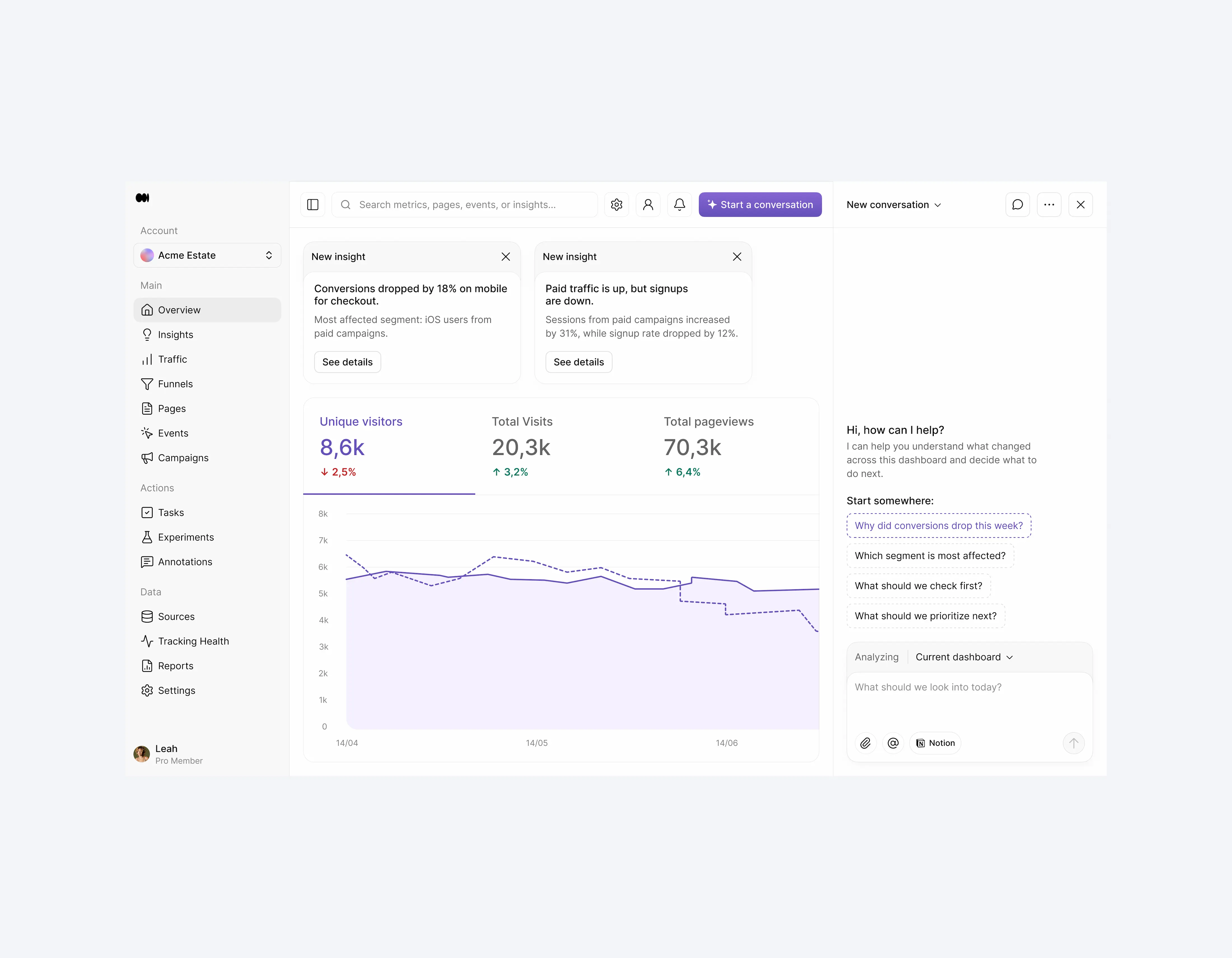
Main user flow
The main flow focuses on a simple scenario: conversions dropped this week, and the user wants to understand why.
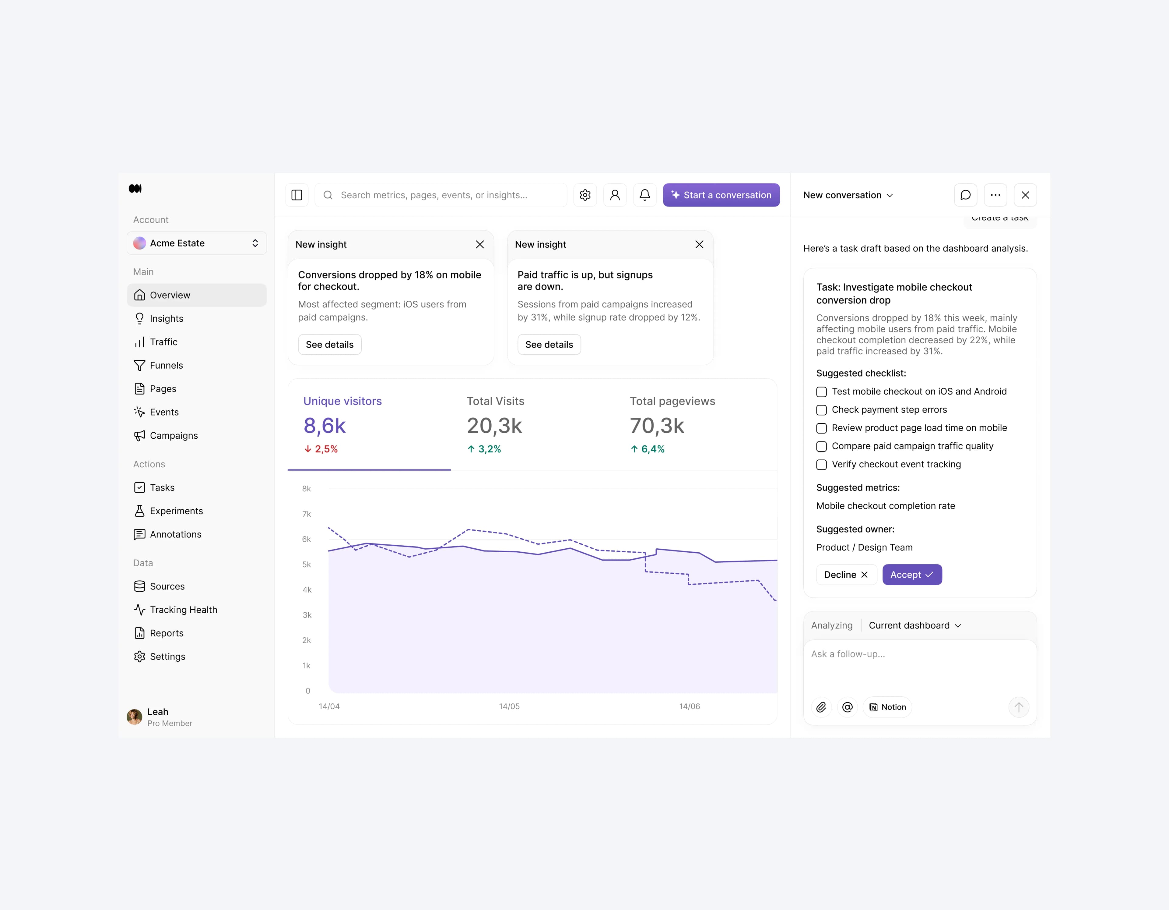
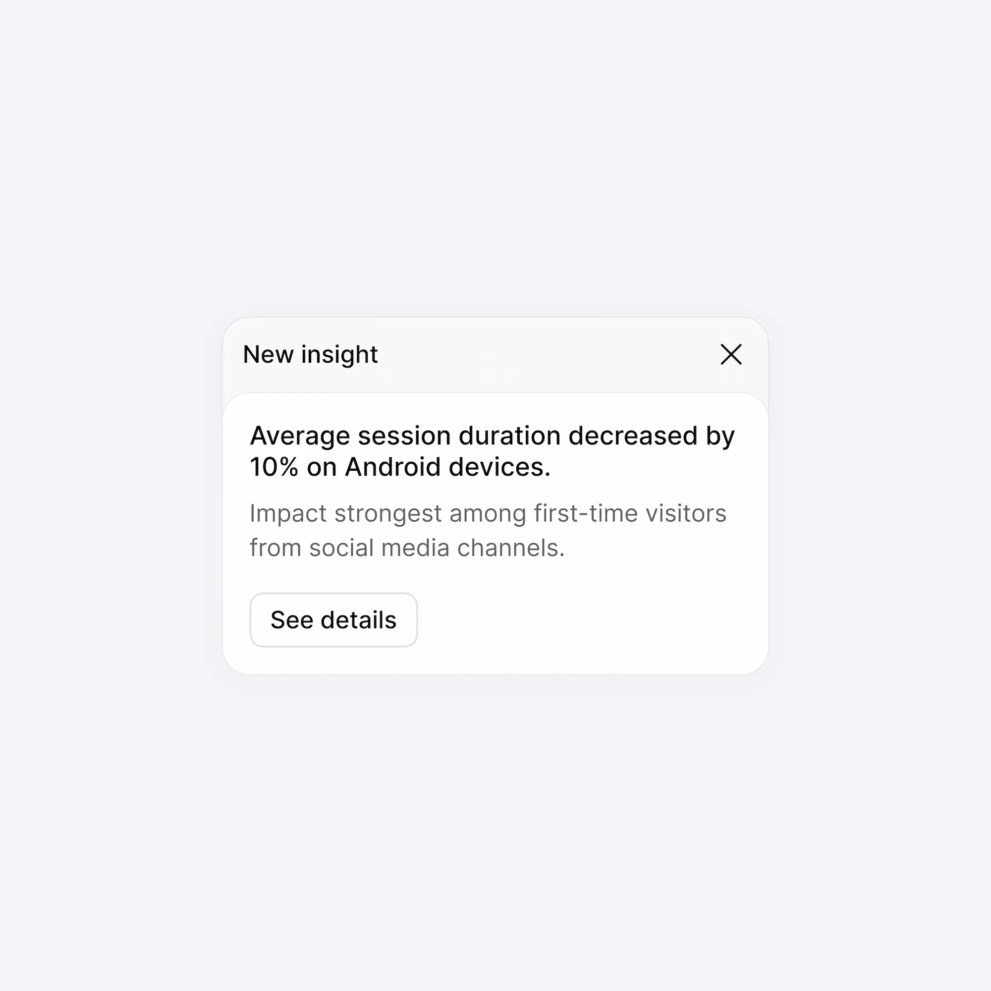
First, the user connects an analytics source or uses demo data. The interface then shows a focused analytics dashboard with key metrics, priority insights, and recent anomalies. Instead of forcing users to navigate through multiple reports, the product highlights the signals that deserve attention.
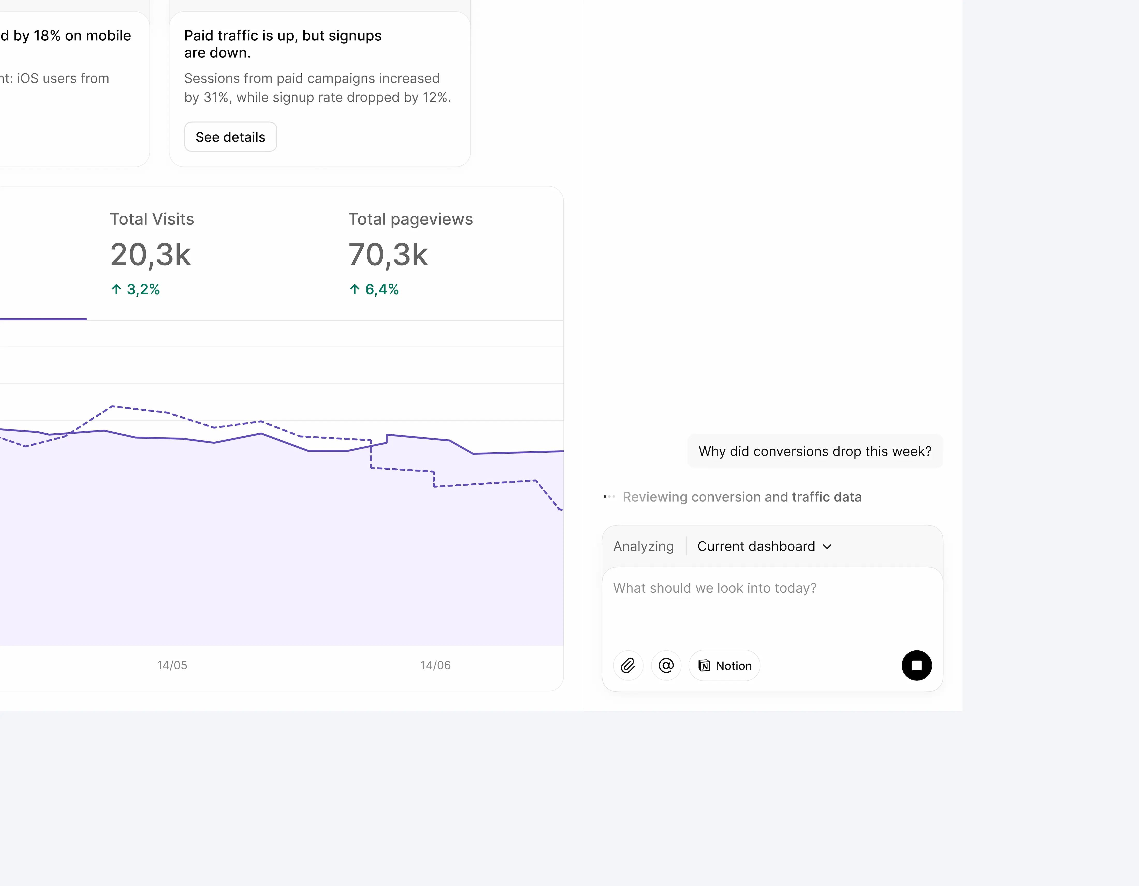
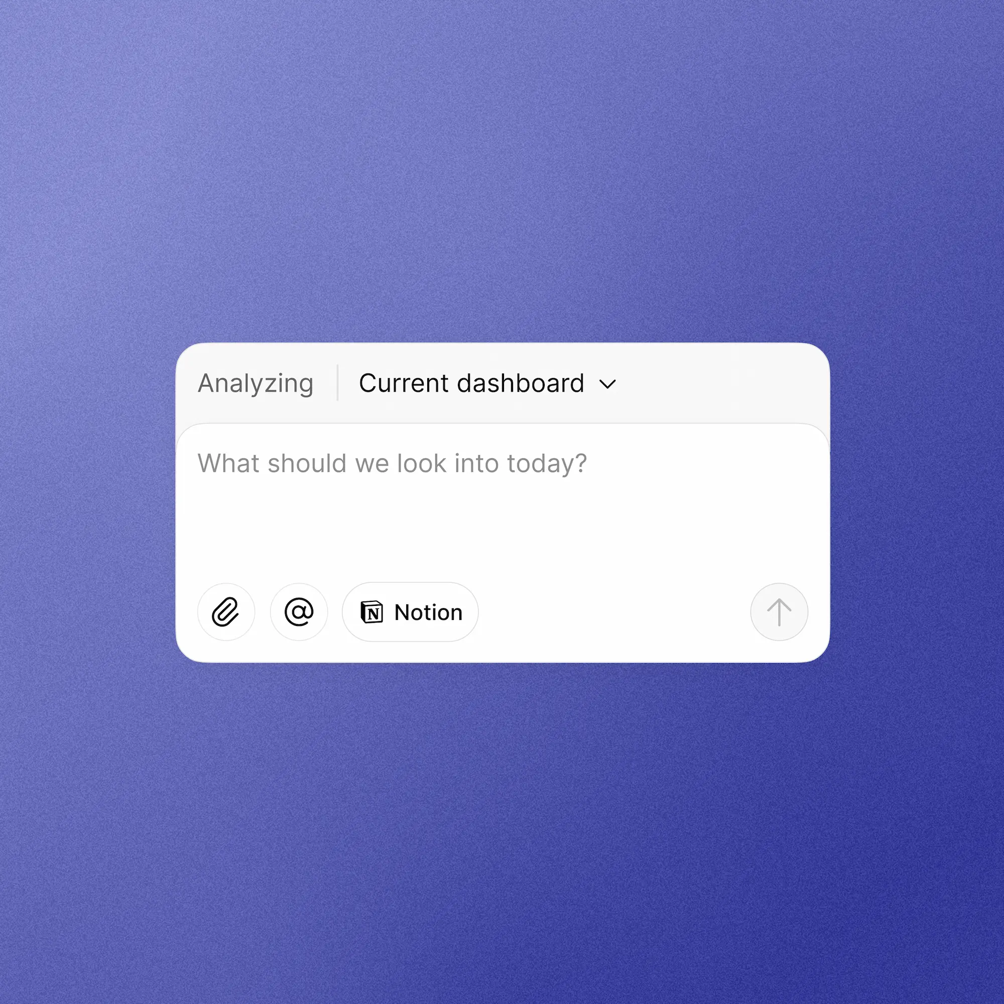
The user opens the AI Assistant and asks:
“Why did conversions drop this week?”
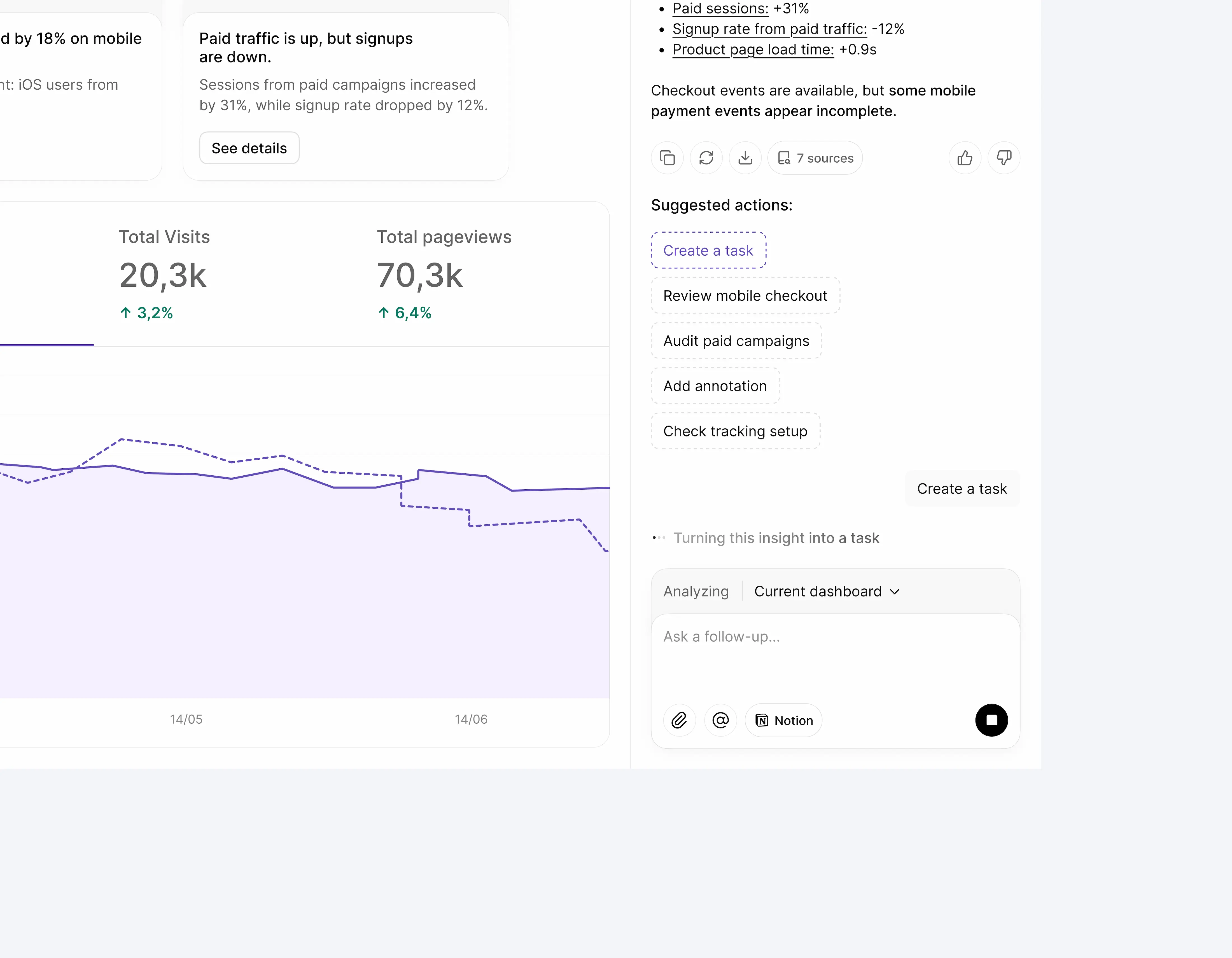
The assistant analyzes the current dashboard context: visible metrics, date range, traffic sources, funnel data, device breakdown, page performance, and tracking health.
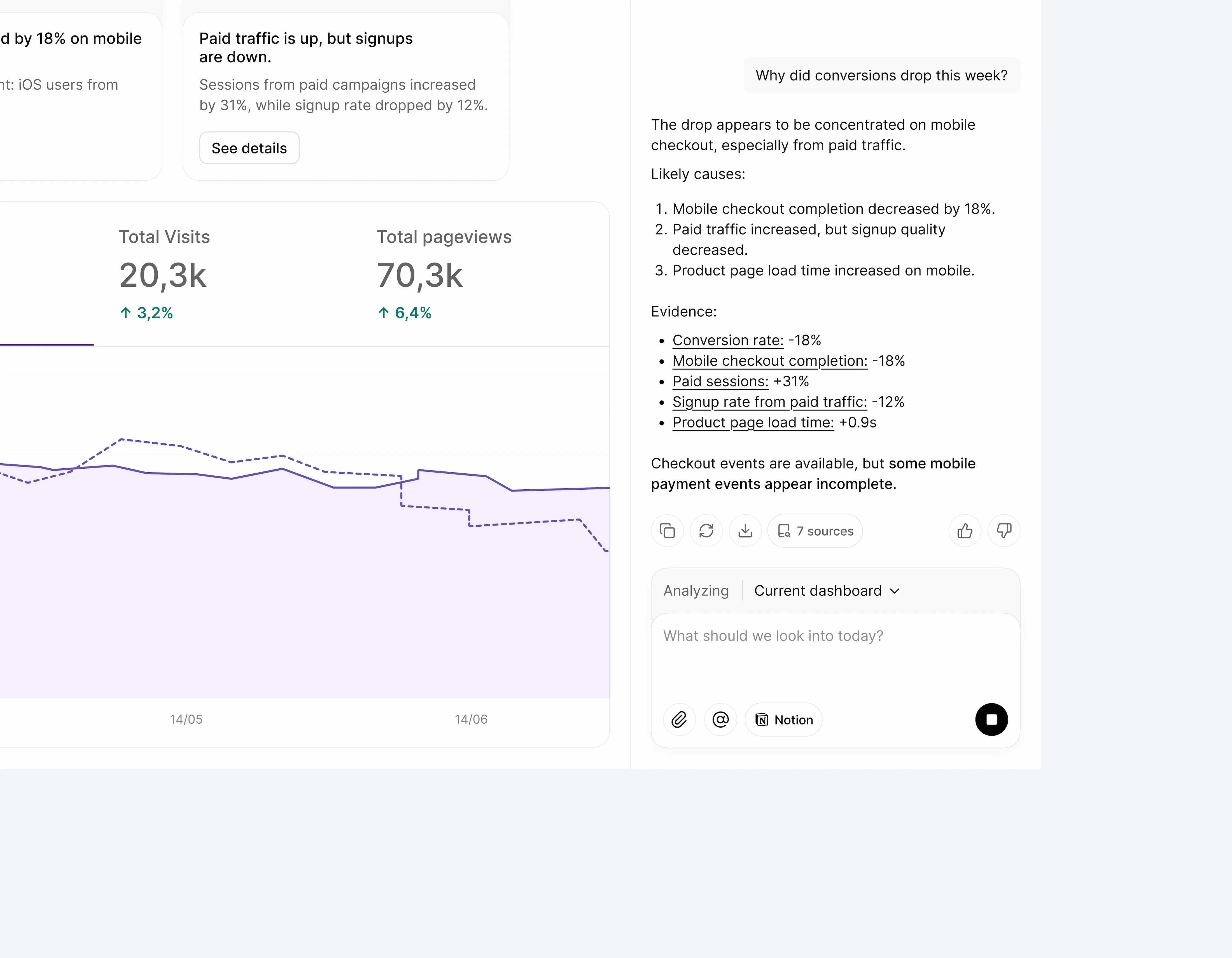
It responds with a structured diagnosis:
- a short summary;
- likely causes;
- supporting metrics;
- supporting sources;
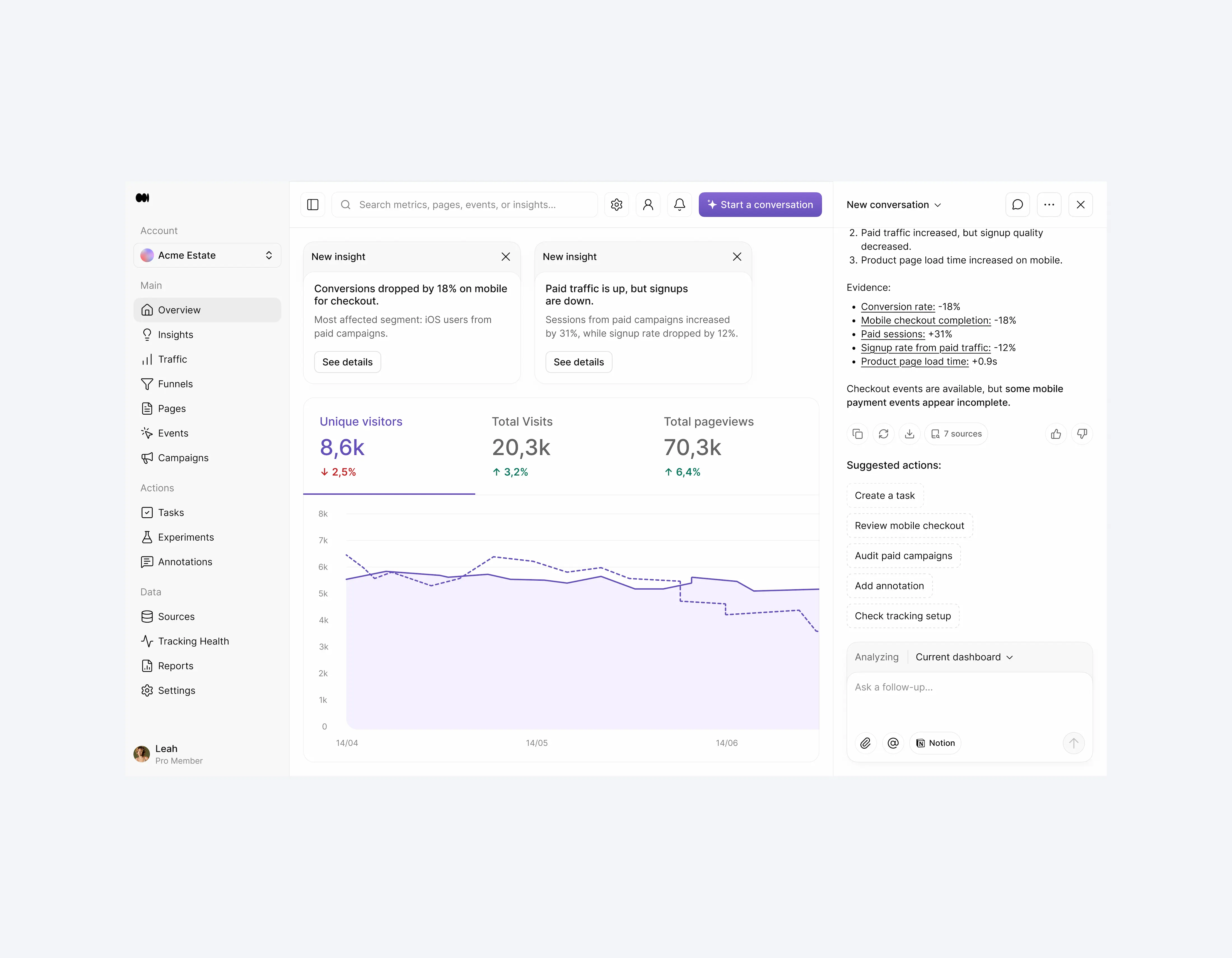
- suggested actions.
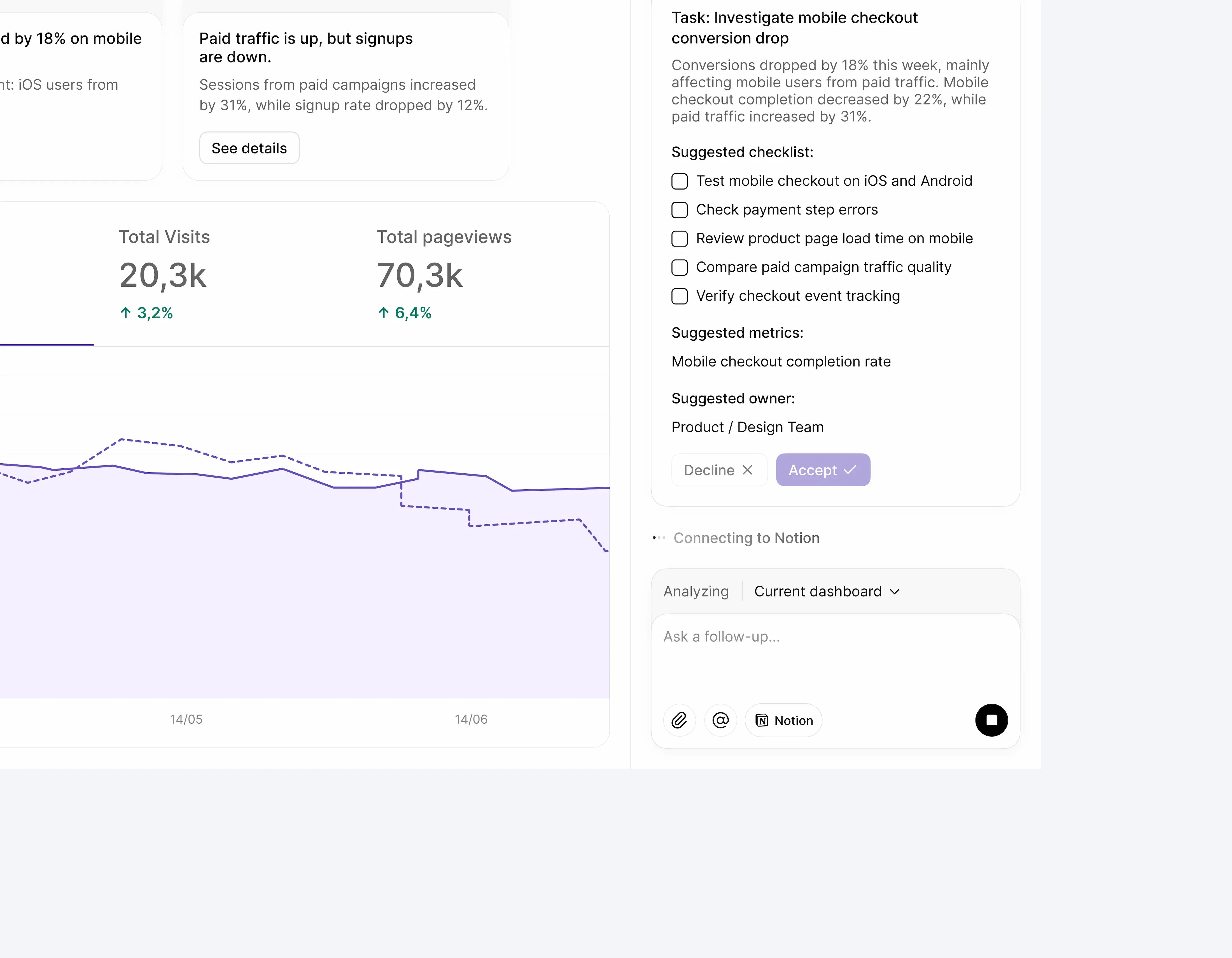
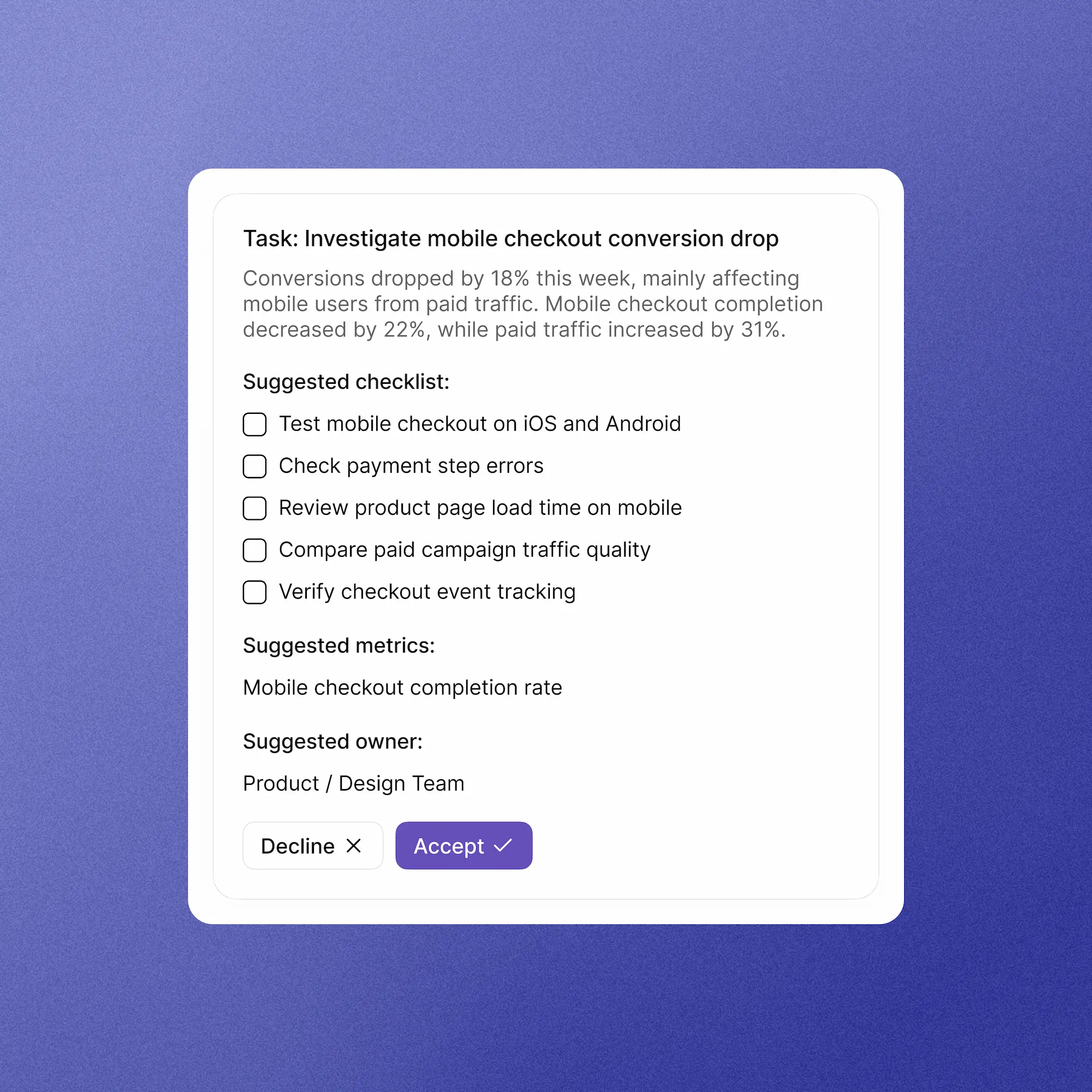
From there, the user chooses to create a task for the product team. The assistant generates an editable task draft with a title, description, checklist, suggested owner and success metric.
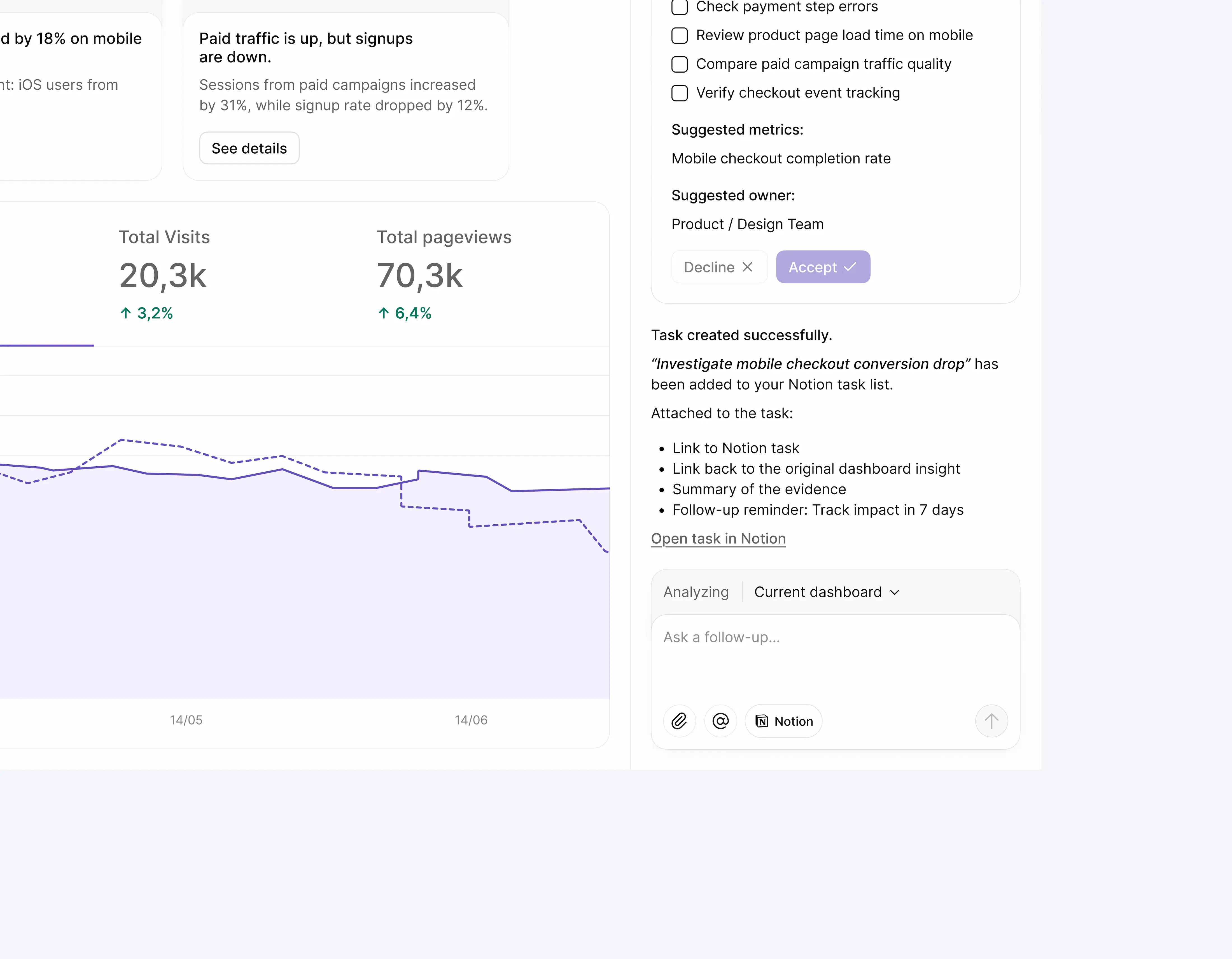
Once accepted, the task is created in Notion with the original analytics context attached.
This flow demonstrates the core value of the concept: the experience does not stop at “the AI answered.” It helps turn a data signal into a team action.
Diapositive 1 sur 8
Key design decision
A common risk with analytics products is trying to show everything: every metric, every report, every segment, every chart.
For this concept, I chose to design a focused workspace around priority insights and decision-making rather than advanced reporting.
Why it matters → The target users are small teams without dedicated analysts. They need to understand what deserves attention first, not build custom reports from scratch.
Trade-off → This makes the product less powerful for data analysts, but much more approachable for founders, marketers, and product managers who need quick clarity.
An isolated metric is rarely enough to make a decision.
A conversion drop may be linked to traffic quality, device behavior, funnel performance, page speed, campaign changes, or tracking issues.
Instead of attaching a separate AI chat to each insight, I designed one central assistant that understands the full dashboard context.
Why it matters → This avoids fragmenting the experience and allows users to ask broader, more natural questions.
Trade-off → A central assistant can feel less specific than an insight-level action. To balance this, the assistant uses the current dashboard context by default and lets users refine the analysis scope when needed.
With AI, the quality of the answer depends heavily on the quality of the context.
By default, the assistant analyzes the current dashboard. But the user can narrow the scope to a specific area such as conversion funnel, traffic sources, mobile users, paid campaigns, landing pages, revenue, or tracking health.
Why it matters → This gives users more control over what the AI considers, without asking them to build a complex report.
Trade-off → Adding a scope selector introduces a small learning curve for non-technical users. To reduce friction, the default option remains “Current dashboard,” so the user can ask a question immediately.
In analytics, an AI answer cannot feel like a black box.
Each diagnosis shows the metrics used, likely causes, and sources. If part of the data is incomplete or potentially unreliable, the assistant says so.
Why it matters → The goal is not to make the AI sound certain. The goal is to make its reasoning verifiable.
Trade-off → Evidence makes the answer slightly denser, but it increases trust and helps users understand whether the recommendation is worth acting on.
The assistant can suggest actions, but it does not execute them immediately.
Before creating a task in Notion, it generates an editable draft that the user can review and adjust.
Why it matters → This keeps the user in control and prevents the AI from pushing incomplete or poorly framed actions into the team’s workflow.
Trade-off → The extra validation step slows the flow down slightly, but it makes the experience more trustworthy and realistic for work-related actions.
Designed impact
The concept is designed to help users move from:
“What changed?” → “Why did it change?” → “What should we do next?”
The experience aims to improve analytics workflows by:
- reducing the cognitive load of reading analytics dashboards;
- helping users identify priority signals faster;
- making AI answers more transparent through evidence and confidence levels;
- turning insights into concrete tasks;
- preserving context between analysis and execution;
- connecting analytics to the tools teams already use;
- helping small teams act without needing to become analytics experts.
The product value is not only that AI can answer a question. It is that the experience creates a bridge between data understanding and team action.
What I would test next
If I continued the project, I would test:
- whether users understand the analysis scope selector;
- whether the AI diagnosis feels trustworthy and easy to scan;
- whether the task draft contains enough context to be actionable;
- whether users prefer suggested questions or free-form prompts;
- which workspace integrations feel most natural depending on the user’s role;
- whether this flow helps users decide faster than a traditional analytics dashboard;
- whether the created task remains useful once the user leaves the analytics environment.